Excel Pie Chart
Excel Pie Charts are a good way to represent data visually
They are especially useful when the author wants to compare the sizes of different data sets.
When To Use An Excel Pie Chart
There are many different types of chart available to us in Excel 2007, and a pie chart is but one. Just take a look:
So how do we decide when to use a pie chart? It might help if we describe what each chart type is useful for.
- Column Chart - used to compare values across categories
- Line Chart - used to display trends over time
- Pie Chart - displays the contribution of each value to a total. You can use it when values can be added together or when you have only one data series and all values are positive.
- Bar Chart - good for comparing multiple values
- Area Chart - emphasises differences between several sets of data over a period of time
- Scatter Chart - also known as an X Y Chart, this chart compares pairs of values. You use it when the values being charted are not in X-axis order or when they represent separate measurements.
You should consider using a pie chart when all of the following criteria are met:
- There is only one data series to represent
- All of the values in the series are greater than 0
- There are 7 categories of less
- The categories represent portions of the whole pie
Creating A Pie Chart In Excel 2007
Excel pie charts are really flexible. Once you've created one, you can rotate the slices for different perspectives and you can also focus on specific slices by pulling them out of the pie chart. Pie charts show the relative sizes of items in one data series as a proportion of the whole. Because only one data series is used to source the chart, the data should be arranged in either one column or one row. If you use column headings for your data, for example, these headings are used to key the pie chart's legend.
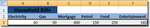
Let's get stuck in and create a pie chart, and we can explore the options as we go. Below is some date about household expenses that we will use to source our pie chart.
Select the data including the column headings and then click Insert > Pie. We are then presented with a small thumbnail gallery showing the types of pie chart we can insert.

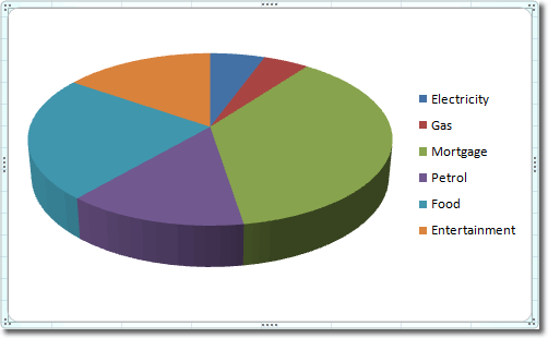
For our example, let's select the first 3-D pie chart. The following pie chart is inserted into the worksheet. Note that it displays a legend that corresponds to the column headings for our data.
While the chart is selected, the chart tools contextual tab will display in the ribbon. Click to enlarge the image below, if you want to see an example.

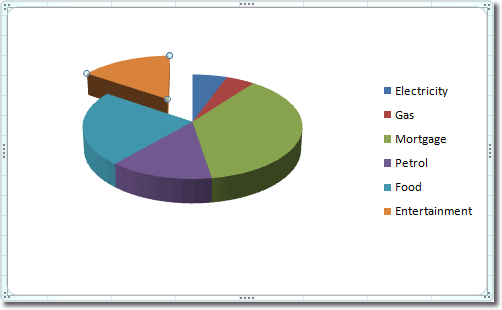
There are many properties of the chart that we can adjust to get just the right kind of look. For now, let's just highlight a certain piece of data that interests us. Let's draw attention to the amount we spend on entertainment by moving that particular piece of the pie out a little. To do this, click on the pie to select it and then click on the slice that you want to move. You'll know when that slice is selected

Only when the slice is selected will you be able to move it. Then it's a simple case of clicking and dragging it out as far as you want it.
Charts in Excel are flexible in that they adjust immediately when you change the data. For example, if you reduce spending on entertainment to 100, as soon as you press Enter, the size of each piece of pie affected is adjusted accordingly.
Excel 2007 Topics
- Home
- Excel Spreadsheets
- Navigating Excel 2007
- Excel Tables
- Excel Pivot Tables
- Formulas In Excel
- Styles
- Document Themes
- Conditional Formatting
- Naming Cells
- Templates
- Protecting Workbooks
- VBA Excel
- Excel Download
- Microsoft Office 2010
- Excel Password
- Excel Merge Columns
- Excel Macro
- Excel Shortcut
- Comments
- Freeze Panes
- Excel Pie Chart
Excel 2007 Technical